


Generated content (the ::before and ::after pseudo-elements) is quite handy for styling elements without disrupting markup. We can use it for creating things like custom checkboxes without any extra elements.
Usually, we want to use an empty string as the value for the content property. This ensures that the pseudo-element is purely decorative and will not lead to unexpected announcements by assistive technologies.
::before {
  content: "";
}
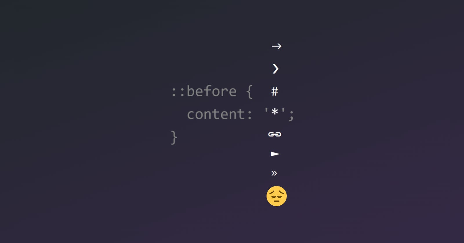
However, we might sometimes get the urge to use unicode characters in the content. A few common examples include:
*at the end of labels for required inputs#or🔗near clickable headings (fragment links)►to indicate expandable content❯or»between breadcrumbs
If these symbols are used with content, it could cause a confusing experience for users who rely on assistive technologies.
::before {
  /* ❌ don't do this! */
  content: "#";
}
In the future, we might be able to specify an empty alt text (Adrian Roselli has a great article on this topic), but support is lacking currently.
::before {
  /* someday */
  content: "#" / "";
}
So what do we do?
Use svgs! The mask technique that I demonstrated above in the custom checkbox demo is a great way to use svgs without leaving CSS.
::before {
  --svg: url(...); /* can be a remote url or a data url */

  content: "";
  background-color: currentColor;
  -webkit-mask-image: var(--svg);
  mask-image: var(--svg);
}
Okay but text is nice
Fine! I get it. Good news: I may have just found a way to do this accessibly. Let me show you.
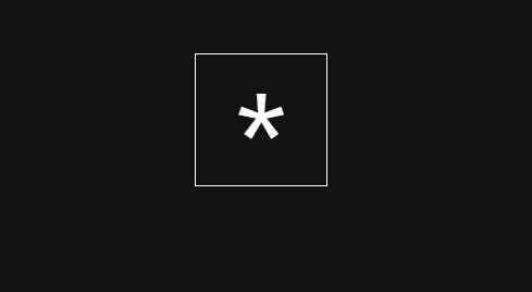
We will still use the mask technique, but instead of using a real svg icon, we will construct one on the fly using a data url. And we will put our text inside the svg using a <text> element. For the purposes of this guide, let's use the * character to put at the end of a required label.
<svg xmlns="http://www.w3.org/2000/svg">
  <text>*</text>
</svg>
Let's add some attributes for positioning and styling the text. You can adjust these to your liking.
16x16
viewBoxto correspond with default font sizefont-family='system-ui'so it adapts to the system fontfont-size='1rem'should be the default but you can adjust for your desired sizetext-anchor='middle'for horizontally centering the textx='50%'andy='100%': I will admit I kept adjusting these randomly until the symbol was close to the center of the box 😅
<svg viewBox="0 0 16 16" xmlns="http://www.w3.org/2000/svg">
  <text font-family="system-ui" font-size="1rem" text-anchor="middle" x="50%" y="100%">*</text>
</svg>
We can now put that in a data url and assign it to a custom property for ease of use. Note that some symbols might need to be replaced (for example, # becomes %23).
--svg: url('data:image/svg+xml;utf8,<svg viewBox="0 0 16 16" xmlns="http://www.w3.org/2000/svg"><text font-family="system-ui" font-size="1rem" text-anchor="middle" x="50%" y="100%">*</text></svg>');
Sweet, now we can use it with the mask technique. We'll use the ::after element because we want this to appear after the label text. We do need to give it a width and height explicitly (or use position: absolute). And let's also add forced-colors support.
label::after {
  content: "";
  -webkit-mask: var(--svg) no-repeat center;
  mask: var(--svg) no-repeat center;
  background-color: red;
  display: inline-block;
  width: 1em;
  height: 1em;

  @media (forced-colors: active) {
    background-color: CanvasText;
  }
}
And we're done!
Pretty neat, if you ask me. 😄