The native <dialog> element is neat. It has the correct semantics, it appears in the top layer, it keeps track of focus, and it gives you mostly intuitive ways to open/close it. So if you want a modal dialog, you can just drop a wee dialog.showModal() on your page and call it a day, right? Not quite.
Initial focus
By default, when the dialog is shown, it will focus the first focusable element inside it. If it's a modal dialog, it will trap focus so that the rest of the page is "inert". When closed, focus will return to the dialog trigger.
This default behavior works well when the very first thing inside the dialog is a close button.
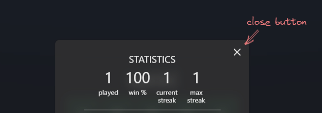
But when there is a bunch of text before the first focusable element (e.g. a link in a paragraph), it could result in a confusing experience for screen readers as focusing that element would skip all the prior content. It could also be confusing for sighted users if the prior content is so lengthy that it scrolls off screen.
Solution: Manually set initial focus on what makes the most sense. This is achievable, without any JavaScript, by specifying tabindex="-1". This makes the element focusable but not tabbable. For example, we could set tabindex="-1" on the first heading inside the dialog, and it would be automatically focused when the dialog opens.
If you want to learn more, Scott O'Hara has a good article that goes into more detail on this topic and links to github discussions.
Prevent page scroll
By default, a modal dialog makes the rest of the page "inert". Ideally, this means the user can't interact with anything outside the page, but I found one scenario that it doesn't fully cover: The user can still scroll the page when the dialog is open.
Thankfully, the solution is quite simple: we can use :has to check if the page has a :modal dialog and that it is currently open. If it is, then we set overflow: hidden to disable scrolling.
html:has(dialog[open]:modal) {
  overflow: hidden;
}
This will probably cause layout shift, so let's fix that with scrollbar-gutter.
html {
  scrollbar-gutter: stable both-edges;
}
While we're waiting for Firefox to ship :has, we could use JavaScript to set overflow: hidden on the page, or we could treat this as progressive enhancement and leave the default behavior unchanged.
Something I've also noticed is that when the root scroller is not the <html> but some child element inside <body>, then the page is no longer scrollable, even though the scrollbar is still visible. That makes it even easier for us to treat this as progressive enhancement.
.root-scroller {
  block-size: 100dvb;
  overflow: auto;
  scrollbar-gutter: stable both-edges;

  &:has(dialog[open]:modal) {
    overflow: hidden;
  }
}
Here's a codepen you can play around in:
Light dismiss
There are three ways to dismiss a dialog:
Pressing the
EsckeySubmitting a
<form>withmethod=dialogExplicitly calling
.close()on the dialog using JavaScript
But we usually also want to close all modal dialogs when clicking the "backdrop" area (this is called "light dismiss" sometimes).
This is a bit tricky. There is nothing like a "backdropclick" event, so we need to rely on regular click events and call close() in the correct place.
I've found two ways of doing this. Unfortunately, both of them require wrapping the dialog's contents in a separate element that takes up the entire space inside the dialog. This means there must be no padding on the dialog itself (we even need to undo its default padding). And we need to propagate any explicit sizes (e.g. max-height, width, etc) to the content wrapper.
<dialog>
  <dialog-contents>
    ...
  </dialog-contents>
</dialog>

<style>
  dialog {
    padding: 0;
  }
</style>
After this, we can go one of two ways.
We can set up two separate click listeners: one on the <dialog> where we call close, and one on the content wrapper where we call stopPropagation.
const dialog = document.querySelector('dialog');
const dialogContents = document.querySelector('dialog-contents');

dialog.addEventListener('click', () => dialog.close());
dialogContents.addEventListener('click', (e) => e.stopPropagation());
Alternatively, we can add a single click handler to <dialog> and conditionally call close only if the event target is the dialog itself, and not any nested elements.
const dialog = document.querySelector('dialog');

dialog.addEventListener('click', (e) => {
  if (e.target === e.currentTarget) { // or e.target === dialog
    dialog.close();
  }
});
Looks weird, but it makes sense when you consider that the ::backdrop is actually part of the <dialog> element.
And here's a codepen you can play with:
Update: Jonathan Neal has found a way to achieve this without a content wrapper (see codepen). This can be neat for basic use cases, but be careful when using it together with a popover component.
Bonus: setting display
You may have encountered this already if you've worked with <dialog> before. When the dialog element has a display property (usually grid or flex for layout purposes), then it will no longer stay hidden when it's closed. That's because we are overriding this rule from the user-agent stylesheet:
dialog:not([open]) {
  display: none;
}
Normally, fixing this would involve repeating that same rule in our own stylesheet, or setting display only for dialog[open] (thanks Kilian). But since we are already using a content wrapper for light dismiss, this is a non-issue. We can set our display property on the wrapper.
<dialog>
  <dialog-contents>
    ...
  </dialog-contents>
</dialog>

<style>
  dialog-contents {
    display: grid;
  }
</style>
Bonus 2: close animation
Currently, it is straightforward to animate a dialog on entry. Not so much on exit, because of display: none that gets applied by the UA stylesheet. (It will be possible to animate display: none in the future though 👀).
Now, you could override the UA stylesheet and do all sorts of hacks with visibility/pointer-events, but you don't need to. There is a much simpler and robust solution.
Instead of only calling dialog.close(), firstly call .animate() with your desired keyframes and options. And then when it is finished, commit the styles and call close(). Job done.
dialog
 .animate([{ opacity: 0 }], { duration: 200 })
 .finished.then(animation => {
   animation.commitStyles();
   dialog.close();
 });